www.creamistry.com
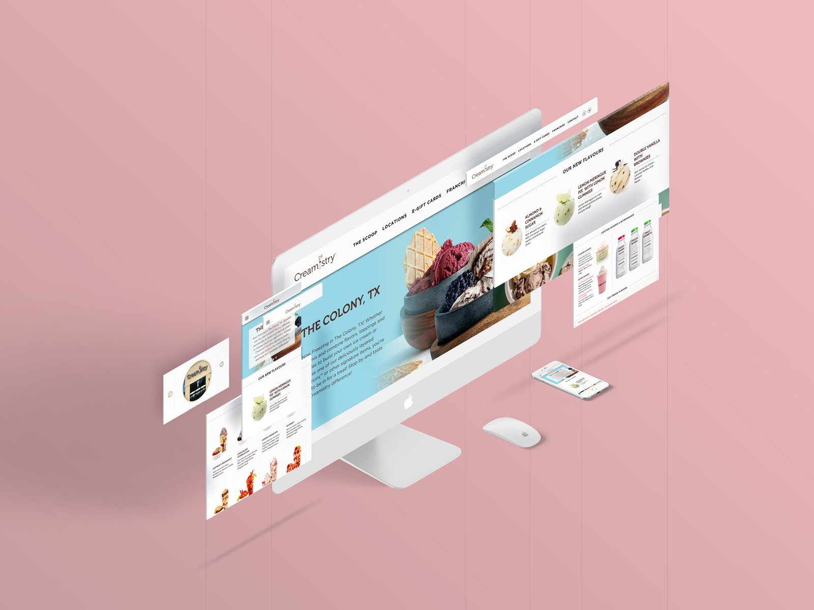
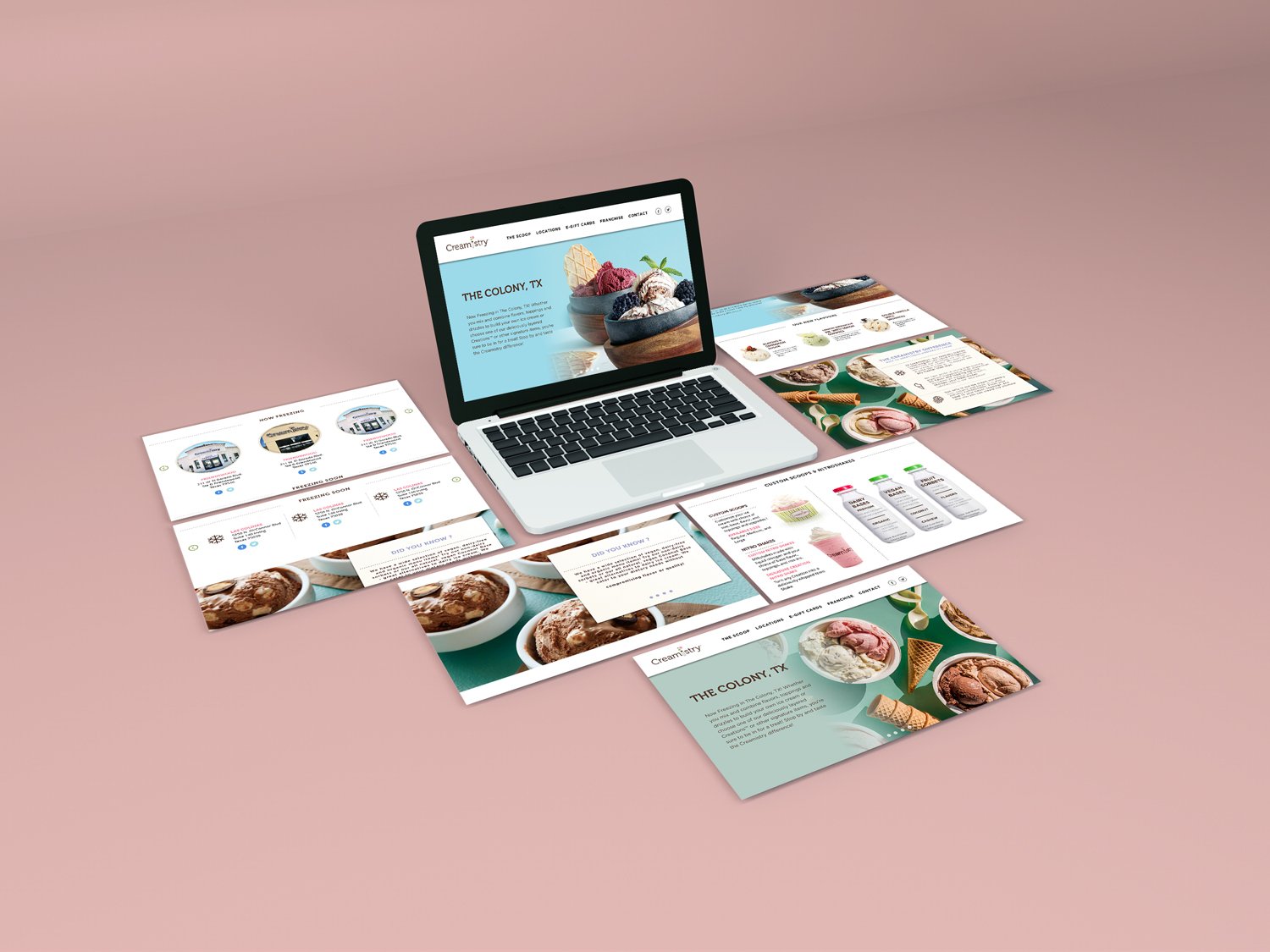
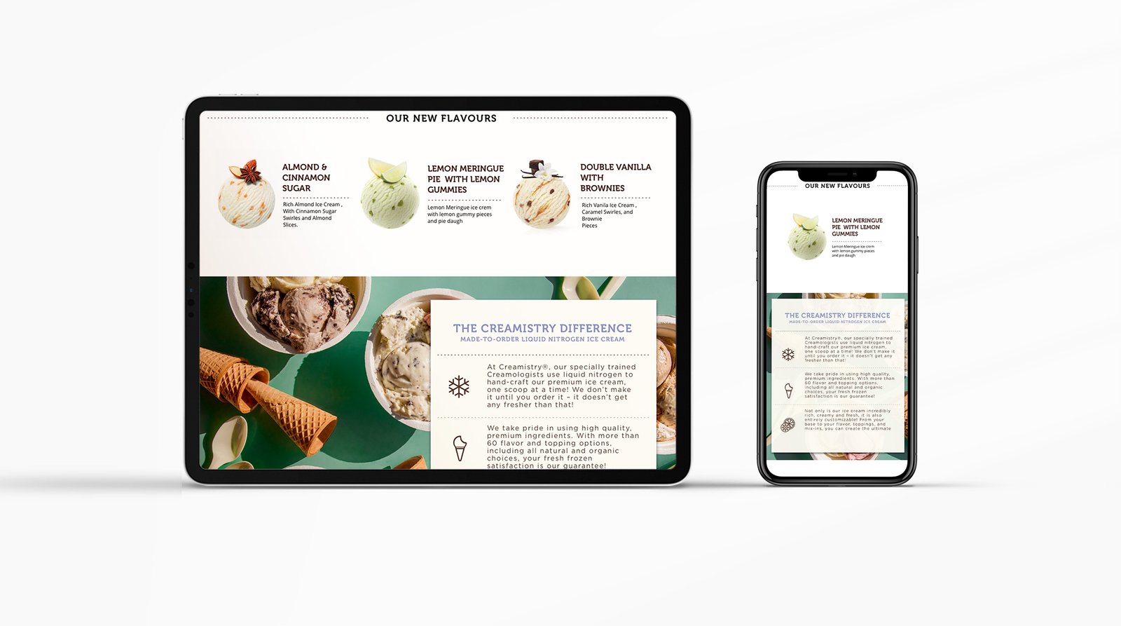
When tasked with designing the website for the artisen ice cream franchise Creamistry the client needed the website to have a young and fun feel while retaining a rich exqucite look.
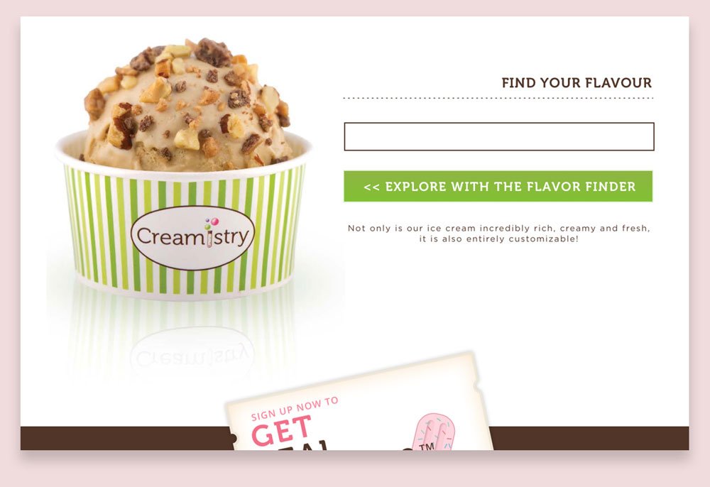
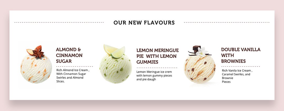
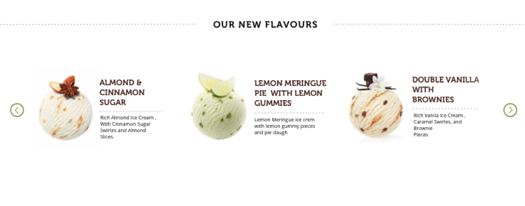
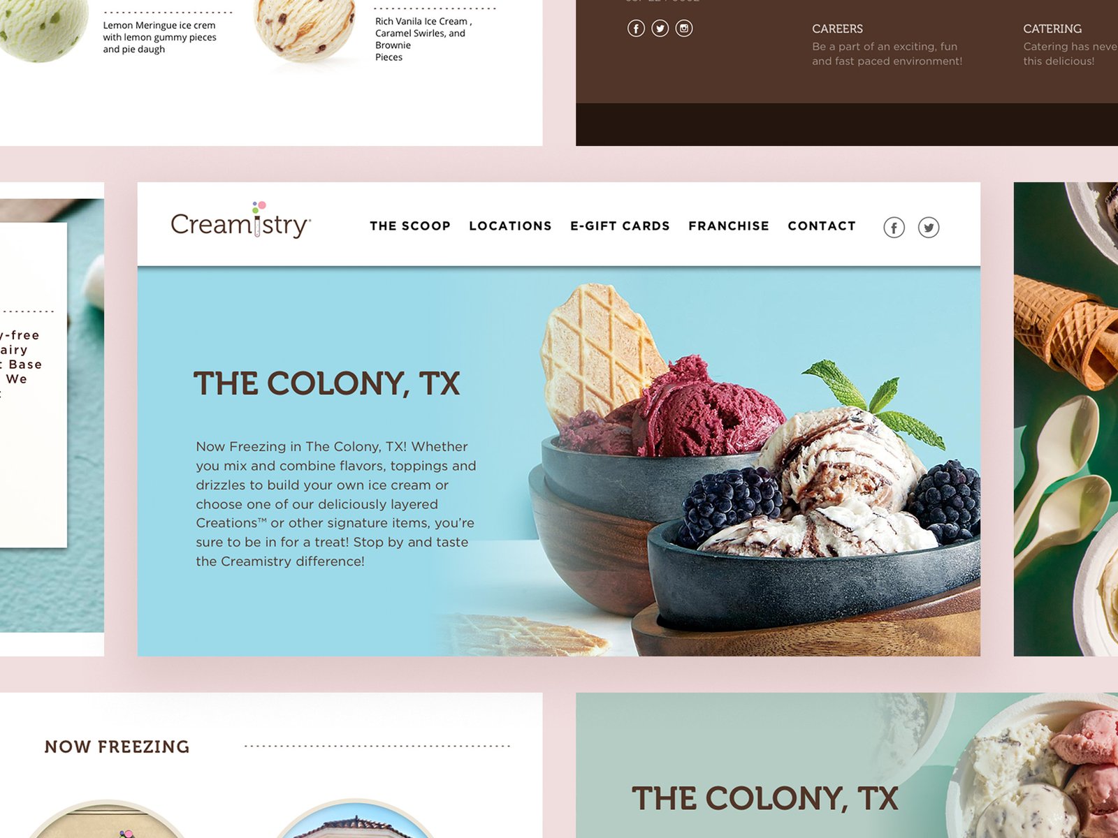
To achieve the desired outcome with the user interface, a light pastal color pallet was used with blend of whites and offwhite tiles.
Client
CreamistryDate
21 August, 2018Services
UI/UX DesignerAgency
Web Sites Design Solutions- Orange CA USA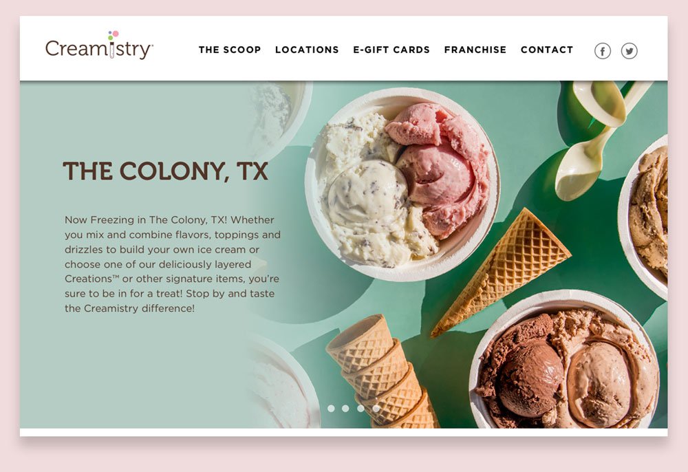


Used Resources
The logotype , the texts and print examples as well as the high definition images were provided by the client.

Focus On User Experience
Plentiful use of white spaces in products pages , highlights the products while giving a more minimal elegant feel with lots of space to breath.
Purposfuly Responsive
From the get go the website was designed with mobile in mind , so eache and every section of the site is designed to carry into mobile interface without breaking or pausing the experience.